Really Live It Up Until We Die 2023
Neil Gall
* 1967 in Aberdeen
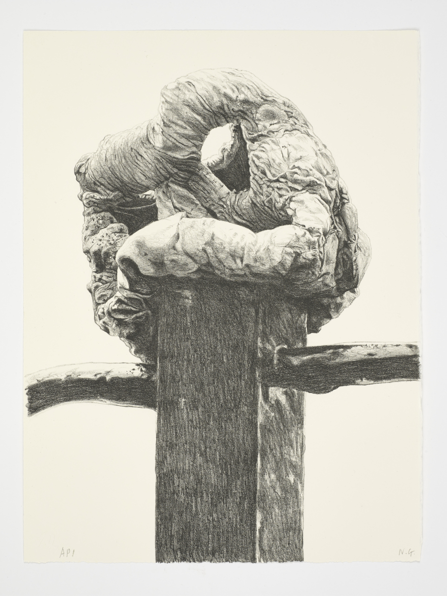
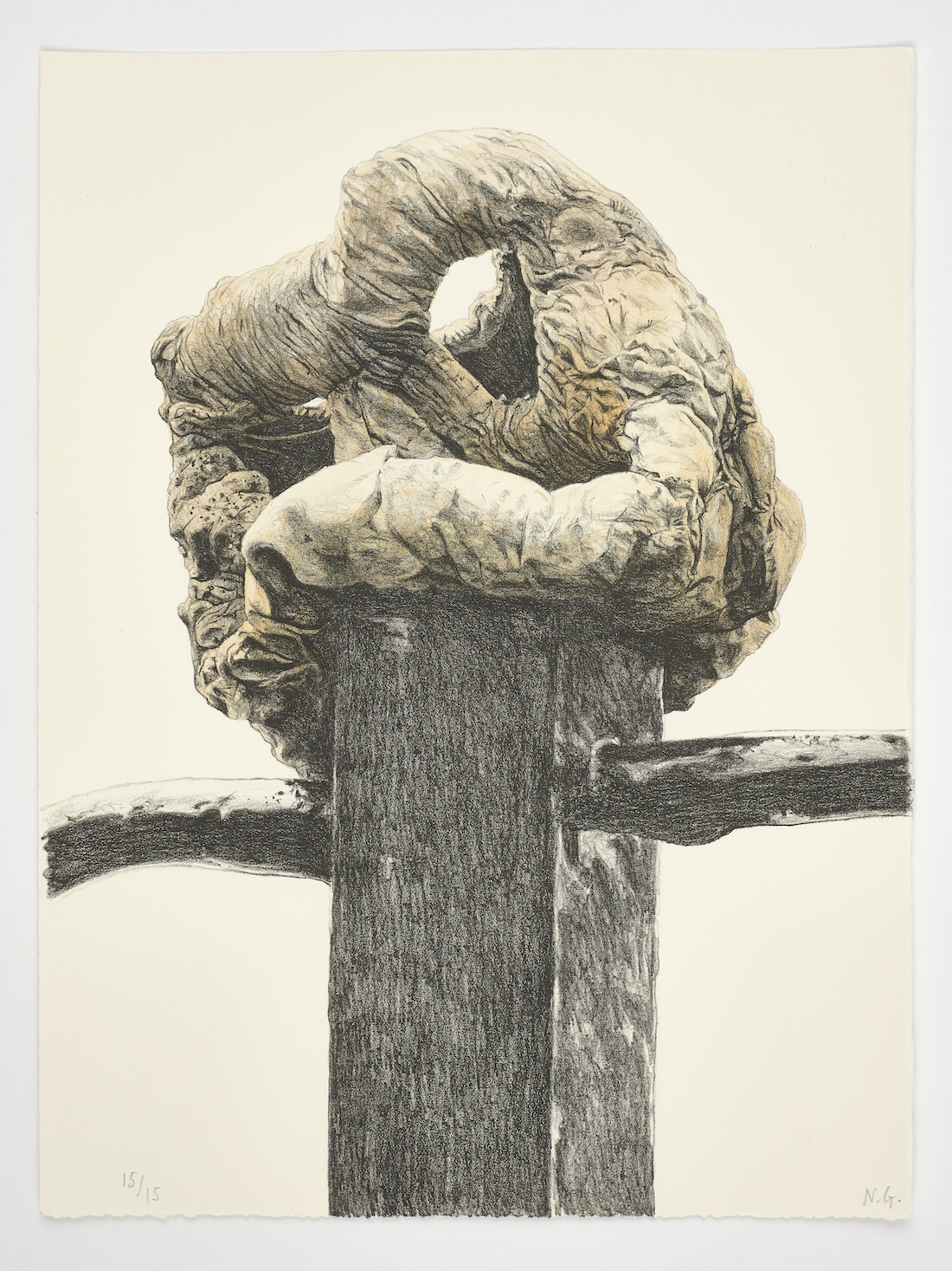
Lithograph in black on Soft Somerset White. Size of sheet: 38.3 x 28.6 cm.
Signed and dated.
Printed in an edition of 15, with 3 hand coloured by the artist.
Published by: Emanuel von Baeyer London 2023.
Single print £ 350.-
Hand-coloured single print £ 550.-
(To view, please click image above and scroll)
The complete set in a portfolio £ 2400.-
The complete hand-coloured set in a portfolio £ 3600.-
"For those familiar with my work the images in this suite of lithographs will be recognisable from their depiction in various drawings and paintings over the last 20 years. Like a cast of characters, they appear in various mediums, mostly in colour; sometimes singly often in groups and arrangements. If one wants to move the analogy on further still, the characters can be seen as actors whilst the larger compositions are suggestive of a stage. In fact, an early work was titled ‘Cast’ (2003), a huge 10-foot painting portraying an array of objects hanging in and around a grid-like wire basket set in a very shallow space with strong lighting and stark casting shadows. As well as a reference to the lighting and its shadows it is an overt nod to the idea of theatre, performance, and (the accompanying) actors. In my mind it made the anthropological nature of my lumpen forms easily assimilated as sentient beings. When depicted alone these humble bits of detritus of course became portraits.
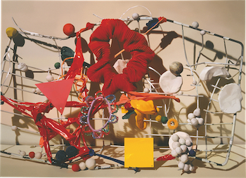
Cast, 2003, oil on canvas. 223.5 x 305 cm. Collection Simmons & Simmons, London.
Way back then I used to really struggle with titles or the ‘naming’ of the works. I mean, it really was a torment. I had read somewhere of a surrealist-like technique of opening a book at random and blindly pointing at a phrase or word. Wherever your fingertip landed would be the title of your artwork, Bingo! easy and weirdly, it seemed to work for a while, titles tumbled out of nowhere (or my subconscious) producing by some miracle words that fitted the picture. ‘Materials for Reasoning’ is one such title, originally for an assemblage of lumpy plasticene forms in a surrealist looking still life of 2005. The title is re-purposed in one of the new lithographs as ‘Material for Reasoning’, note the singular, and the old title in the plural seemed apt for the group as a whole. The motley crew of assembled lumps depicted in the lithographs don’t really make any sense at all of course, they are really about unreason. I try to create them without any pre-conceived idea of form or content, cobbled together with an almost childlike abandon. They are only reasonable in the context of the ever-expanding nexus of objects and creatures concocted in my imagination. The only logic around them is that they make sense in my imaginary world.
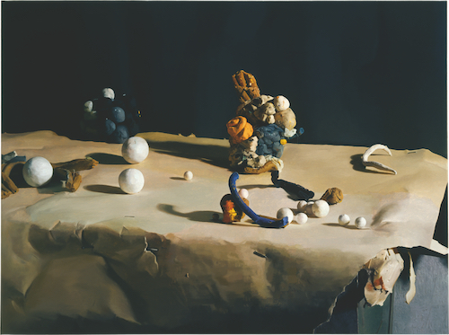
Materials for Reasoning, 2005, oil on linen. 109 x 147 cm. Private Collection.
Studio practice, or how I spend my time might be divided into time periods of 70% painting, 25% drawing and 5% sculpture. For sculpture that means not only the fashioning of all these odd quirky characters (these are actually done very quickly, and I tend to refer to them as ‘models’) but the more time-consuming mould making and casting and finally painting of objects. The finished sculptures are in fact intricate copies of an original.
Printmaking of any kind is rare for me, and these 8 lithographs are my first proper engagement with the process. Lithography made on a stone or on a ball-grained aluminium plate is a technique that is as close to drawing as you can get in the world of print. The problem for the artist is that it lulls you into a false sense of it being the same thing. My first attempts were desultory, it’s not possible to draw on the plate without a plan because there are no ways of changing direction with the image. Every mark you put down is there at the beginning and there at the end, there is no rubbing out or smearing or smudging to make tones. It’s like walking on a tightrope, at any time you could fall off, one false move and that’s it. The other thing about litho is the conceptual idea that even though you ‘draw’ with a pencil (the very greasy and difficult to keep sharp Korn litho crayon) what you actually get after a complicated set of chemical processes is a ‘printed’ image cranked out from a heavy duty litho press. It’s flat and not shiny, a uniform surface. So, when working on a plate one might think one is basically making a monochrome image that to all intent and purpose looks like a graphite pencil drawing, the result is resolutely not like that. For example, there is no variance in sheen that one gets with graphite; black or dark areas are not shiny if you tilt or look at the paper in certain directions. The transformation from greasy pencil drawing to matt printed inky object takes a fair bit of getting used to, some sense of planning and where you will end up, otherwise one’s inky print is a disappointing version of a drawing.
I hope with these 8 prints I’ve made the leap, I’m pretty happy with them and for that I’m most grateful for the patience of Tamarind Master Printer Lee Turner of Hole Editions, Newcastle."
Neil Gall, August 2023.